Project Type
App Redesign Challenge (With a Partner)
Project Date
July 2017
Skills/Tools
Interaction Design, Visual Design, User Research, Pain Points, Wireframing, Spacing, UX/UI, Sketch, InVision
PROJECT BRIEF
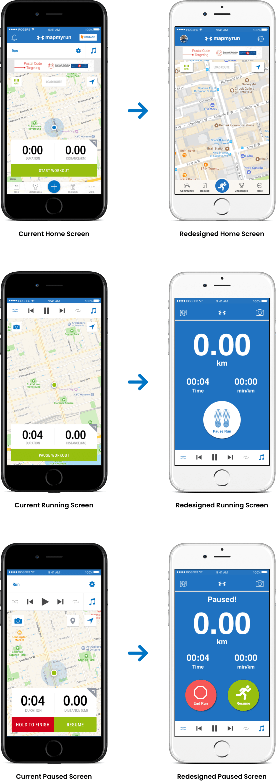
This challenge was an in-class assignment with a partner at BrainStation in 2017. We were tasked with choosing a popular app and redesigning it to enhance the user experience. My partner and I decided to use MapMyRun because he was an avid user of the app, and I had never used it before. We felt that having these two unique perspectives would allow us to identify several pain points across a broad spectrum. Below are the key findings from our research and a few of our redesigned wireframes of the core features of the app.
ORIGINAL DESIGN
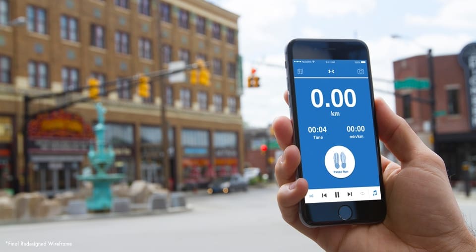
Below are a few screenshots of the main features of the app when we started the project. We thought the designs were clear but concluded the layout and functionality could be improved. Our primary concerns were with the amount of clutter on some pages and the immense number of features within the app overall.
How Might We…
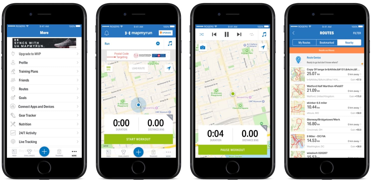
improve the app design to enhance the planning, tracking and performance analysis for runners?
PAIN POINTS
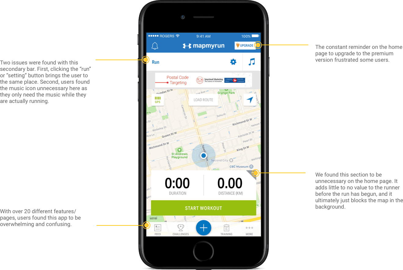
From our experience using the app and the feedback we received from our user testing, we identified four main pain points with the app:
- Too much clutter
- Functionality issues
- Too many features
- Layout issues
FILTERED SEARCH
We were able to make a number of design improvements to increase the usability of the app and enhance the overall user experience. We started by taking a step back and thinking of the core needs this app should satisfy. For a runner, their primary need is to track time, distance and pace while they are running. Our user research also taught us that it’s important for runners to have easy access to their routes pre-run and a place to track their performance progress post-run.
The designs that we developed below bring these core needs to the forefront by adding increased emphasis and accessibility to them.
